Posts by: Paul Rumens
Palmolive Luminous Oils
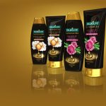
Palmolive Hair Care have introduced a new indulgent range – Luminous Oils.
Artwork Notes:
A premium look and feel was needed for this range. Two seperate blacks where used to ensure a rich background, a special gold was used for the type, drop and pool to ensure a consistent metallic sheen and colour was achieved. The hero illustrations were supplied, but underwent colour adjustments for clean printing, including a Cool Gray being used for the camellia flower. The hero drop and pool where created in-house using 3D software and illustration.
Render Notes:
The final pack renders where created in 3D software.
Kettle Taste Sensations
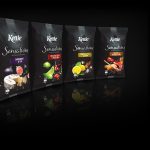
Kettle are offering a premium collection of chips with new decadent flavours…
Artwork Notes:
The hero photography was produced by compiling stock images then creating and adding shadows and reflections to complete the scene.
A overall matte varnish was applied with knock out windows allowing the glossy pack to show in the logo area. Finally, the foil of the pack is allowed to show through in the variant banner and pattern banners at the top and bottom.
Great care was given to the four colour images to ensure the blend with a single black was smooth.
Render Notes:
The final pack renders where created in 3D software.
Cuddly Aroma Intense
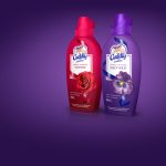
Aroma Intense is a premium fabric conditioner that leaves an intense signature fragrance for up to 100 days.
Artwork Notes:
With a short deadline, no hero photography and and no time for illustration, thinking outside the box was required. Flowers and ingredients were acquired from various sources such as florists, online stores and even a private garden. These were brought in house to photograph, and heavy retouching was required to get the images pack ready. The ribbon was redrawn as vector for clean printing. An spot matte varnish was applied overall with the exception of the ribbon and flowers to give a real premium feel. Distortion was applied to the artwork to counteract the shrinking process.
Render Notes:
The final pack renders were created in 3D software.
Natural Chip Co.
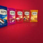
Made with only real ingredients and absolutely nothing artificial, the Natural Chip Co. wanted a fresh look to express great tasting chips, naturally…
Artwork Notes:
The chips used were shot individually, the arrangement, including lighting and shadows, was then produced. Finally the colour and flavour flecks, different for each flavour variant, were added. The hero photography was produced by compiling stock images then creating and adding shadows and reflections to complete the scene. Special care was taken with the translucent and glass elements to create show through and refraction.
A matte varnish was applied to the logo area to differentiate from the rest of the pack.
Due to the number of colours available, the background was achieved by transitioning from process to a special colour, ensuring a consistent colour overprint was avoided.
Render Notes:
The final pack renders where created in 3D software.
Gastrolyte
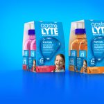
Looking to step out of the shadow of the current market leader, Gastrolyte needed to first select and take ownership of a colour. A redesign utilising this blue ensures they now stand out in the crowded shelf space.
Artwork Notes:
The drops were separated to create the background. Using blue and process colours to ensure consistency and a smooth blend with the background.
Photography was done for the hero child, and subtle retouching for a natural look
Render Notes:
The final pack renders where created in 3D software.
Biltong Man
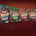
The Biltong Man wanted a new look before expanding and offering his products to major stores.
Artwork Notes:
The photography was produced by compiling a series of stock images. Shadows and reflections were created to complete the composition.
To ensure a consistent front logo lock up across the range, careful consideration was required due to the intricacies of the print process. The hero logo and the wooden board were completely deconstructed and rebuilt using a selection of special colours, seperate from the usual 4 colour work. A matte varnish was applied overall.
Render Notes:
The final pack renders where created in 3D software.
Kettle Popcorn
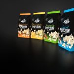
Kettle have expanded their range by adding a healthy popcorn offering, with exciting flavours, all ready to go.
Artwork Notes:
The photography was produced by compiling a series of stock images. Shadows and reflections were then created to complete the composition. The background was created by overprinting a second black over a special colour. As the substrate was foil, this was allowed to show through in places to create a sense of depth. An overall matte varnish was applied with windows for the glossy substrate to show through
Render Notes:
The final pack renders where created in 3D software.
Palmolive Divine Blends
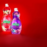
Palmolive have added Divine Blends to their range, skilfully blending two scents to create a premium feeling.
Artwork Notes:
Colgate-Palmolive wanted to push their new shrink sleeves process. A sense of depth was created by making windows in the opaque white to allow the colour of the liquid to show though in places, and then print a darker complementary colour over the windows to enhance it even further. The imagery was backed by two whites to really make it pop off the background. Finally distortion was applied to the artwork to counteract the shrinking process.
Render Notes:
The final pack renders where created in 3D software.
Ajax Spray n’ Wipe
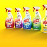
Ajax now has greater impact on shelf with a new bright, all encompassing design.
Artwork Notes:
Colgate-Palmolive wanted to put their new shrink sleeves process to the test with a full body shrink. This job was to be the bench mark for Colgate-Palmolive worldwide. Great care was taking to ensure the colours could be easily managed on press. The artwork was created in specialised 3D software to minimise the disruption created by the shrink sleeve process.
Render Notes:
The final pack renders where created in 3D software.
Palmolive Oil Infusions
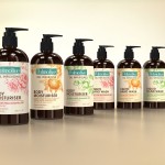
Oil Infusions from Palmolive are carefully blended with real, natural ingredients together with oils for a more a premium feel.
Artwork Notes:
What looks like a simple label is far from the truth, the illustrations were originally supplied, but once they were placed at the correct size it was clear they were not suitable for use in this instance. This meant they had to be adjusted and recreated in-house, using traditional methods of good old paint and ink. Once the illustrations were approved they where scanned in and created out of 2 colours, a light colour with a darker shading colour overprinted to give depth. A special buff colour background and cold silver foil bands around the logo finished the effect.
Render Notes:
The final pack renders where created in 3D software.
Hooplas
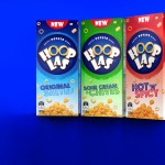
Hooplas are a new product for Snack Brands Australia, fun, bitesize snacks for all younger demographics.
Artwork Notes:
Starting with the hero logo lockup, the roundel and typography needed to be scalable, this meant it had to be recreated using vectors to give resolution independents. The hero Hooplas were placed, and then the lighting and shading were added.
The hero pile of Hooplas at the bottom of the pack, and the single scattered Hooplas were photographed, then colour and flavour flecks were added for each flavour variant. The background was created with two special colours to give control on press.
Render Notes:
The final pack renders where created in 3D software.
Palmolive Hair Care Presentation box
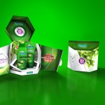
Palmolive have introduced a new Naturals Range of hair care products which blend science and natural products to bring proven superior result. Colgate-Palmolive wanted a presentation box to show off the products to the market.
Artwork Notes:
This was to be the first in a wide range of promotion material. Planning ahead was key. Ensuring that all background and textures where recreated as patterns that’s could be scaled and use at any size. The artwork was then built using these master modular items.
Render Notes:
The final pack render was created in 3D software.
Skins A400
Skins have reinvented sports wear to help you improve your game.
Artwork Note:
Careful control was required to ensure the glow behind the product was consistent, the artwork was built in a way that enable full control of the colours on press, the imagery was supplied from Germany, so the art was built so that it could be dropped in at the last minute across the whole range.
Render Notes:
The final pack renders were created in 3D software.
Westpac

Westpac offer an array of credit and debit cards, the latest offerings strive to stand out from the crowd.
Render Notes:
Before the cards are manufactured, imagery had to be created for advertising and use on their website. A super clean, ultra real look was used for legibility on the web and to show the details of satin finish, spot varnish and multi layered printing. All graphics were kept “live” for the ease of change in the future.
Fluffy Divine Blends
Divine Blends is a new offering created by Fluffy to add a blend of fragrances to your wash.
Artwork Notes:
This was a complex artwork as the wrap is required to have a seamless join. The photography was produced by compiling stock imagery together, shadows and refractions in the water were then created to complete the scene. To produce a rich background, process colours were overprinted onto a spot blue colour. Distortion was applied to the artwork to counteract the shrinking process.
Render Notes:
The final pack renders were created in 3D software.
Nerada Organics
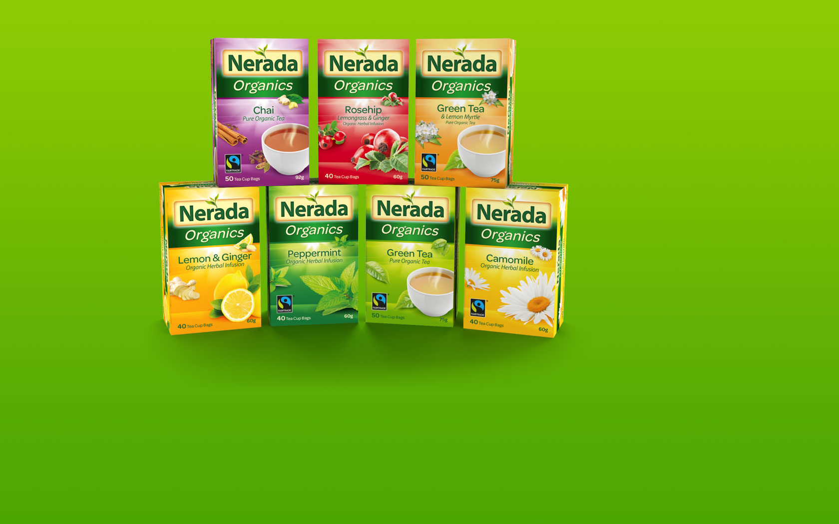
Nerada range of organic teas are grown in Australia using only natural resources. No pesticides, fungicides or artificial chemical fertilisers are used during its cultivation of this premium range.
Artwork Notes:
The Nerada logo, including the glows surrounding the banner, was created using vectors to give resolution independents. The background textures were made of a duotone of 2 spot colours, laying the lighter colour down first then overprinting with a darker colour to add depth. Photography was compiled from stock imagery, with shadows added to complete the image. The tea colour was change in each cup to create a inviting depth.
Render Notes:
The final pack renders were created in 3D software.
Ayam
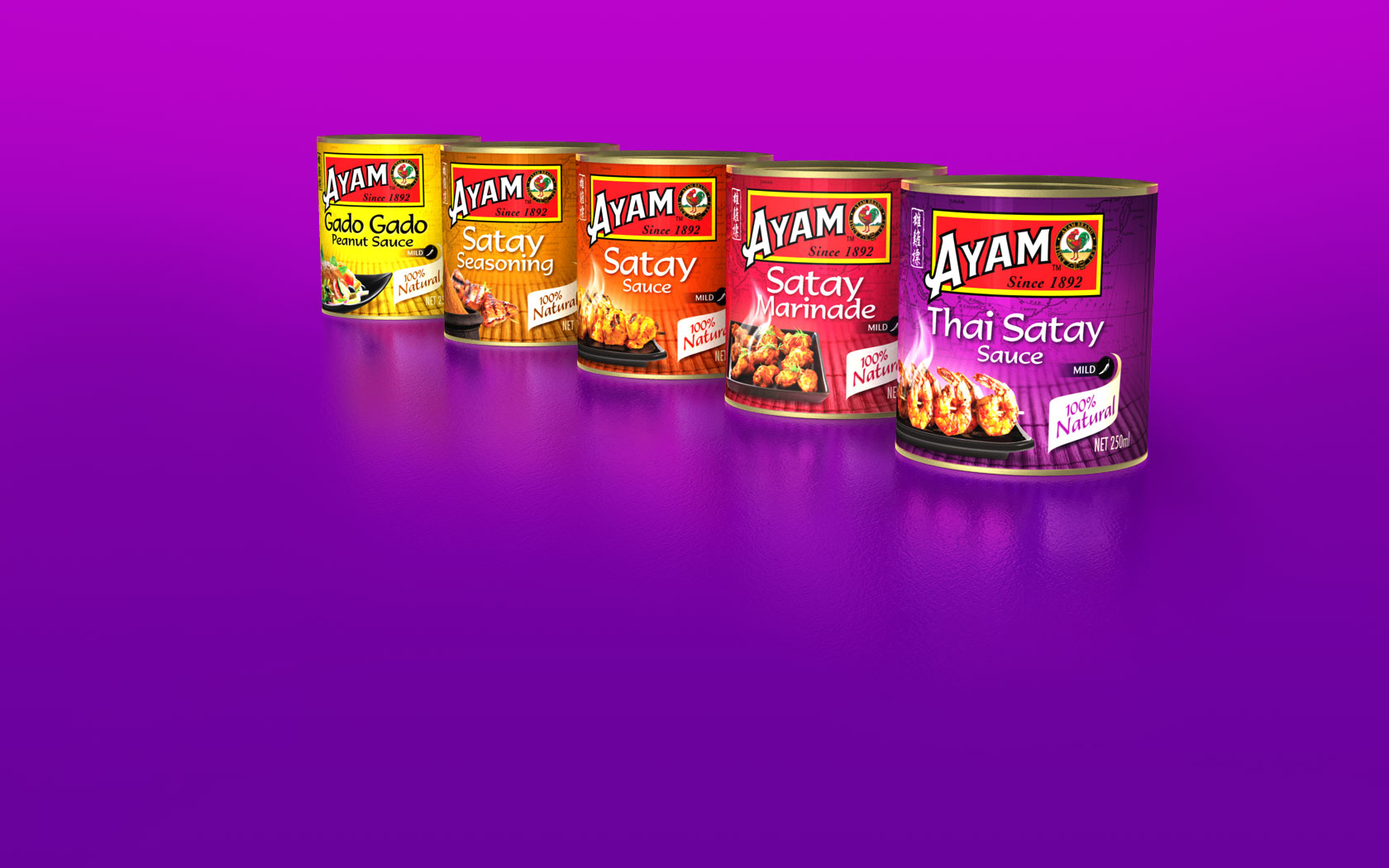
Ayam Brand has its roots on the crossroad of all Asian cuisine and is among the top 200 consumer brands in Asia. This range of sauces adds to their extensive range.
Artwork Notes:
The photography was produced by compiling stock imagery, shadows and reflections were then created to complete the scene.The background is produced by printing a spot colour and then overprinting with 4 colour imagery to add depth.
Render Notes:
The final pack renders where created in 3D software.
Fragrance Temptations
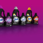
Fab and Fluffy have teamed up to offer a premium fragrance choice for the whole wash.
Artwork Notes:
The logos are vector, making the master logo resolution independent. The background swirl was retouched and separated, enabling colour managed to create the different variants and to keep the colours clean for print.
Render Notes:
The final pack renders were created in 3D software.
Pioneer Block
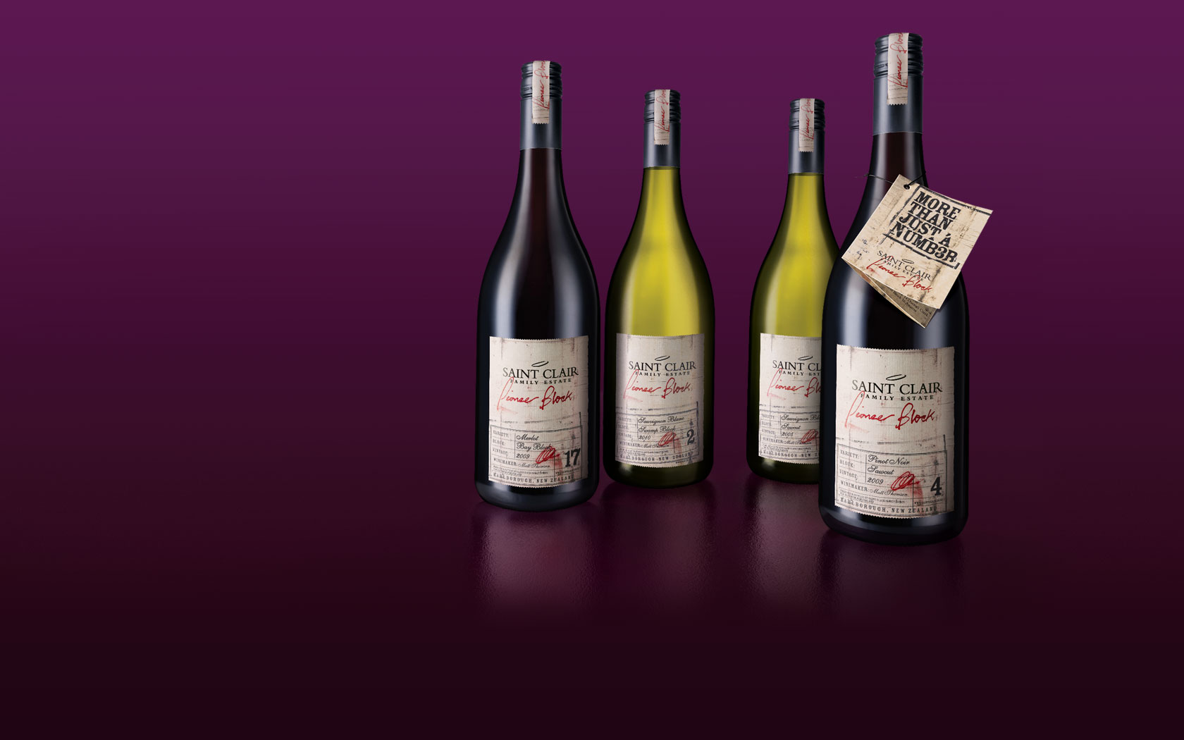
Saint Clair is a multiple award-wining wine producer from Marlborough, New Zealand. Pioneer Block is their exclusive range created by using selective “blocks” from around the winery.
Artwork Notes:
The look and feel was to be a natural worn label, the sepia background was created using a light cream spot colour, then using a brown spot colour for the mid-tones and shadows, black was added to the darkest shadow areas. The Pioneer Block and signature smudge was then added to the background as a spot red colour. The Saint Clair logo was a foil black which added a sheen and slight de-boss effect.
Render Notes:
Photography was taken of hero bottles, these were then retouched to have a matching light source. All the graphics were recreated from artwork files directly onto the bottles to maintain crisp typography and to maximise the look and feel. The type was created “live” to allow the variant and year to be updated as required.
Openair Cinemas
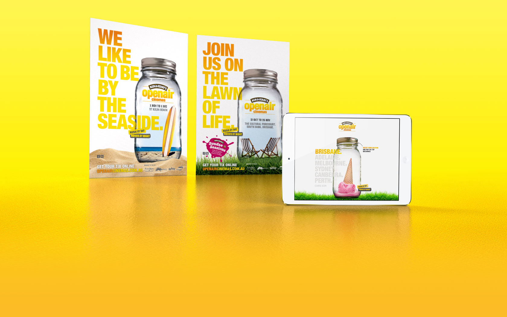
Ben & Jerry’s Openair Cinemas are a quintessential outdoor event, with feature films lighting up huge movie screens from dusk.
Artwork Notes:
Starting with stock imagery, a master jar was created both with and without a lid, that would be able to be used on different backgrounds with different “fillings”. Three different fillings were then created for each of the different locations.
Palmolive Collections
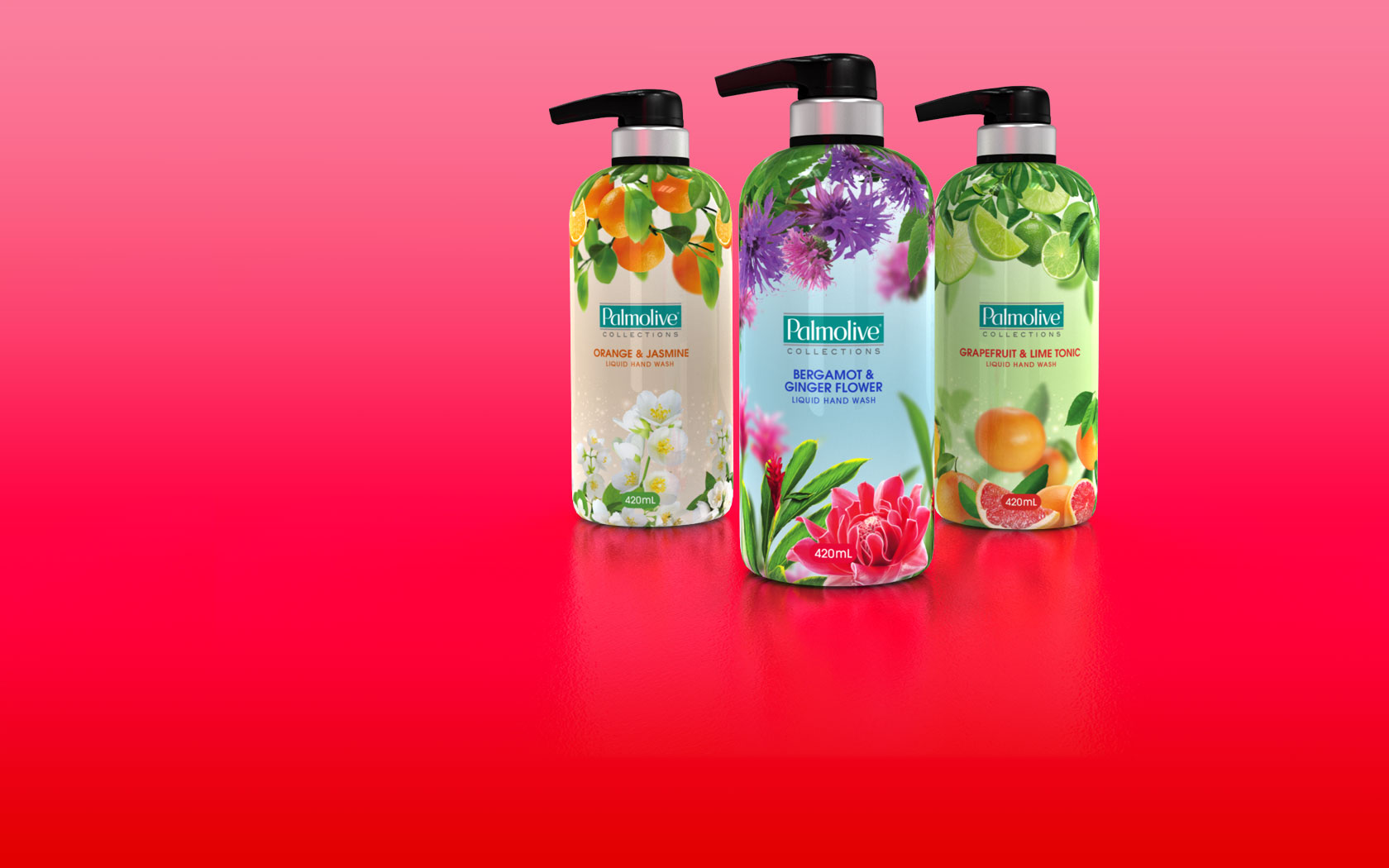
Palmolive is the trusted leading brand in personal care and cleaning. This Collections range was created to add a premium range, giving people a bottle they would like to display.
Artwork Notes:
This was complex artwork as the wrap required a seamless join. Virtual mock-ups were create in 3D to check for distortion around the graphics at the top. A spot colour was added to the background, this required that the soft edges against the process work would blend smoothly.
Render Notes:
The virtual mock-ups where created in 3D which were later used for the final pack renders.
Gatorade
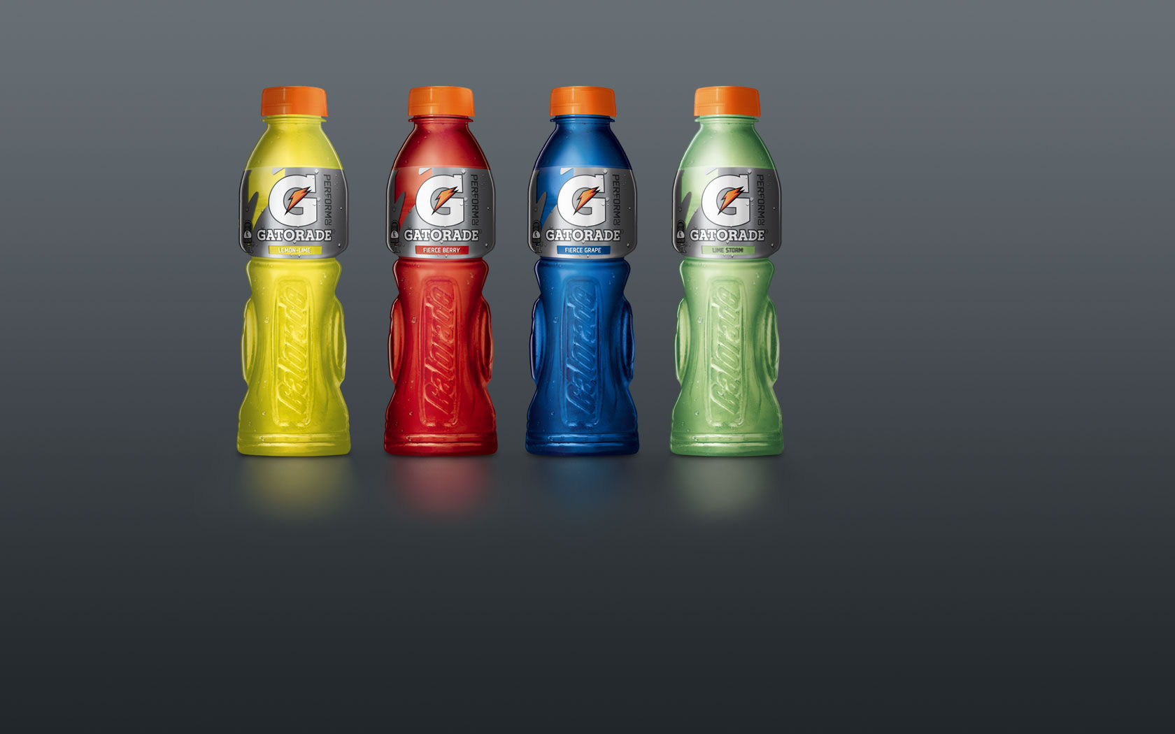
For over 40 years, Gatorade has proven again and again to keep athletes hydrated and performing at their best.
Artwork Notes:
The artwork was created completely as vector. Three silvers were used to overprinted each other in areas to maintain the metallic feel that is lost when overprinting normal spot colours.
Render notes:
The master bottle image was created from multiple bottle photography, the hero image was the bottle with the greatest colour contrast, the tone was created by spray painting a bottle grey which was shot at the same time. A series of colour adjustments were applied to make the different variants.
Fab

Fab leads the way in the laundry detergent market with a range of beautiful fragrances.
Artwork Notes:
The artwork was created completely as vector, making the master logo resolution independent. To create a rich background, process colours were overprinted onto a vignette of variant spot colour.
Render Notes:
The final pack renders were created in 3D software.
Massel Stock
Great quality ingredients are the key to Massel’s delicious taste, their products are gluten-free, vegan and taste great.
Artwork Notes:
The photography was produced by compiling stock images, shadows and reflections were then created to complete the scene. Due to printing restrictions a minimum dot of 3% had to be held across all imagery, so careful colour management of every item was required to keep the imagery as clean and vibrant as possible.
Render Notes:
The final pack renders where created in 3D software.
Transport for London Tube Map
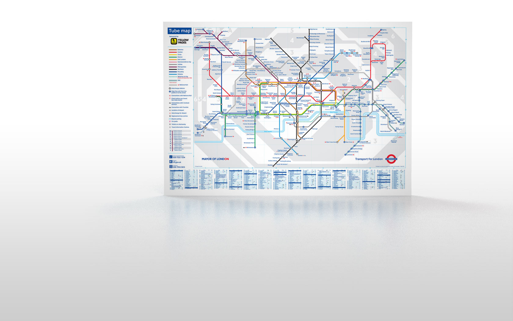
The iconic schematic Tube Map of London is the most famous map in the world.
Artwork Notes:
With the central Zone 1 becoming cluttered, London Transport wanted to find a way to improve the clarity. It was also time to bring the map into modern software. The whole map was reduced by 90% then redrawn from scratch following their strict guidelines, started from the centre and working out.