Left
Skins A400
Skins have reinvented sports wear to help you improve your game.
Artwork Note:
Careful control was required to ensure the glow behind the product was consistent, the artwork was built in a way that enable full control of the colours on press, the imagery was supplied from Germany, so the art was built so that it could be dropped in at the last minute across the whole range.
Render Notes:
The final pack renders were created in 3D software.
Fluffy Divine Blends
Divine Blends is a new offering created by Fluffy to add a blend of fragrances to your wash.
Artwork Notes:
This was a complex artwork as the wrap is required to have a seamless join. The photography was produced by compiling stock imagery together, shadows and refractions in the water were then created to complete the scene. To produce a rich background, process colours were overprinted onto a spot blue colour. Distortion was applied to the artwork to counteract the shrinking process.
Render Notes:
The final pack renders were created in 3D software.
Ayam
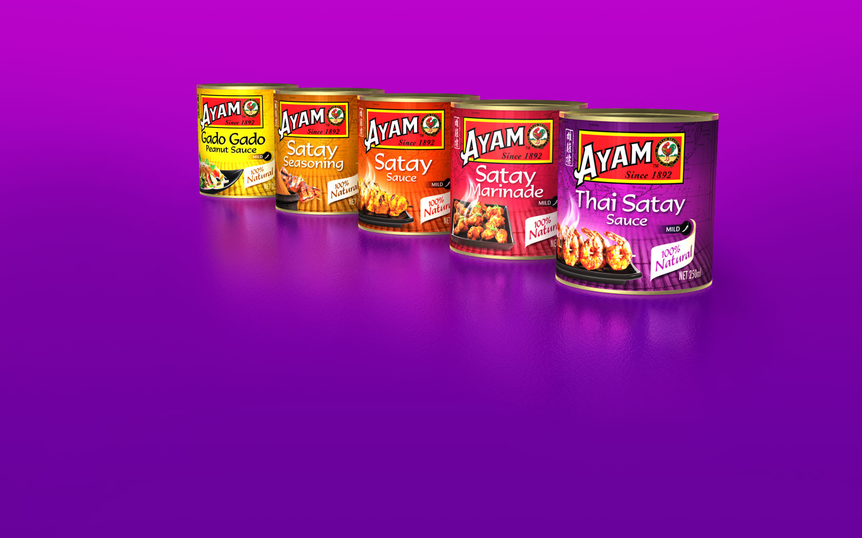
Ayam Brand has its roots on the crossroad of all Asian cuisine and is among the top 200 consumer brands in Asia. This range of sauces adds to their extensive range.
Artwork Notes:
The photography was produced by compiling stock imagery, shadows and reflections were then created to complete the scene.The background is produced by printing a spot colour and then overprinting with 4 colour imagery to add depth.
Render Notes:
The final pack renders where created in 3D software.
Pioneer Block
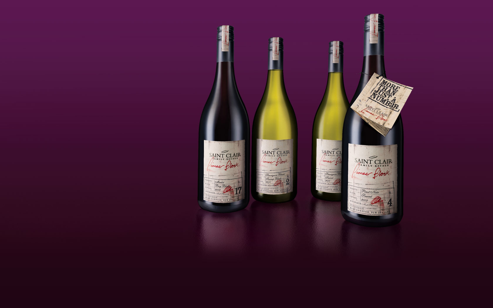
Saint Clair is a multiple award-wining wine producer from Marlborough, New Zealand. Pioneer Block is their exclusive range created by using selective “blocks” from around the winery.
Artwork Notes:
The look and feel was to be a natural worn label, the sepia background was created using a light cream spot colour, then using a brown spot colour for the mid-tones and shadows, black was added to the darkest shadow areas. The Pioneer Block and signature smudge was then added to the background as a spot red colour. The Saint Clair logo was a foil black which added a sheen and slight de-boss effect.
Render Notes:
Photography was taken of hero bottles, these were then retouched to have a matching light source. All the graphics were recreated from artwork files directly onto the bottles to maintain crisp typography and to maximise the look and feel. The type was created “live” to allow the variant and year to be updated as required.
Palmolive Collections
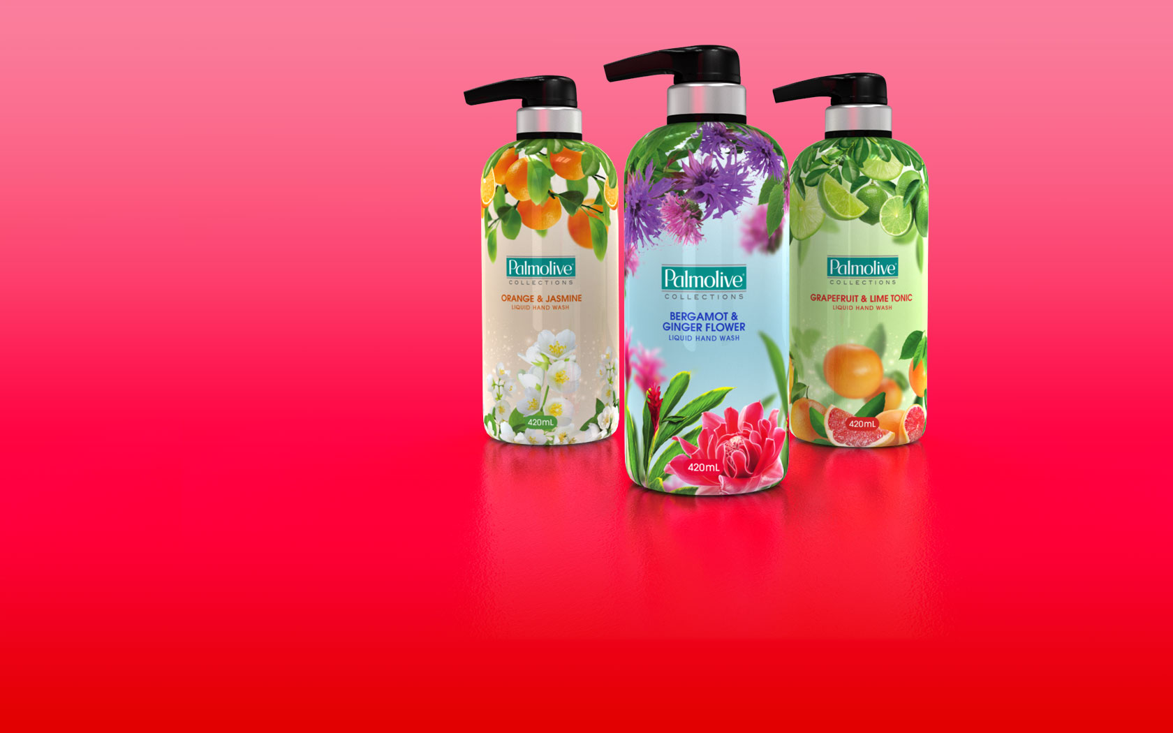
Palmolive is the trusted leading brand in personal care and cleaning. This Collections range was created to add a premium range, giving people a bottle they would like to display.
Artwork Notes:
This was complex artwork as the wrap required a seamless join. Virtual mock-ups were create in 3D to check for distortion around the graphics at the top. A spot colour was added to the background, this required that the soft edges against the process work would blend smoothly.
Render Notes:
The virtual mock-ups where created in 3D which were later used for the final pack renders.
Fab

Fab leads the way in the laundry detergent market with a range of beautiful fragrances.
Artwork Notes:
The artwork was created completely as vector, making the master logo resolution independent. To create a rich background, process colours were overprinted onto a vignette of variant spot colour.
Render Notes:
The final pack renders were created in 3D software.
Transport for London Tube Map
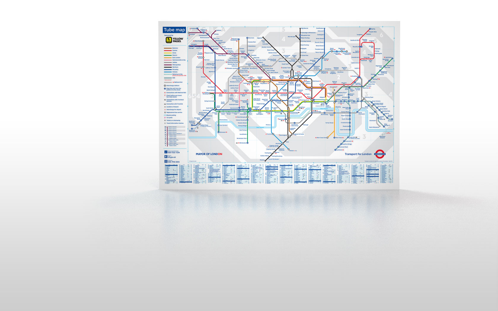
The iconic schematic Tube Map of London is the most famous map in the world.
Artwork Notes:
With the central Zone 1 becoming cluttered, London Transport wanted to find a way to improve the clarity. It was also time to bring the map into modern software. The whole map was reduced by 90% then redrawn from scratch following their strict guidelines, started from the centre and working out.